Friday, June 29, 2012

kitchen renovation - inspiration board

Happy Friday!  How about an inspiration board to kick off your weekend! 

One of my client's is redoing a good portion of her house and we are starting with the kitchen first.  
With any decorating project (whether e-decoarting or in-home, I start with an inspiration board to set everything in motion.  Not only is it an essential part for me to see the design and piece everything together, but it's always great for the client to start to visualize what the space will be like. 

Here is what is on the agenda:
-install dark hardwood flooring
-paint existing cabinets white
-subway tile backsplash
-simple white countertop
-add a large island with sink and seating - will open up into living room. 
-island will be dark hardwood with same countertop as cabinets
-build new cabinets around fridge
-add a breakfast nook
-window treatments on the window


I'm really excited about this project and can't wait to see the progress we make! 


Enjoy your weekend and there will be another #Oliohop on the blog on Monday!  I'm so excited to share the space that I created with you and what all the other bloggers came up with!

Need help adding the final touches on a room?  Does your room need a complete makeover?  E-decorating is a great, budget-friendly way to get a custom design and inspiration board! Take a look other e-decorating boards I've done and send me an e-mail to lindseyanneinteriors@gmail.com to get started! 

Thursday, June 28, 2012

rooms to love - grey shades

I have a growing library of rooms that inspire me.  It's amazing how much they come in handy when I'm helping someone decorating their own space.  This is much easier to keep organized now with Pinterest, but I still like to keep some off there and just in my own files.  
When I was going through them this morning, these 4 caught me eye.  It's amazing how different ones will interest you on different days.  I picked out the ones inspiring me and once I pulled them all into this post I realized they are all shades of grey!  Can't go wrong with grey!

These tree trunk coffee tables are so great! I love the "broken-in" feel the couch has. 

Ahh a little industrial chic.  The chandelier is a great focal piece and tI love the exposed beams painted white! 

Chic, minimalistic, modern.  Love the monochromatic look with touches of a darker grey.  The white wood floor is perfect in here! 

A traditional look with glamourous touches with mirrors on the closet door and mirrored nightstands.  
sources: 1 / 2 / 3 / 4

Wednesday, June 27, 2012

reader question - look for less

I recently received another design question that I wanted to share for this week's question of the week!

Question: Hi Lindsey!  I'm in love with West Elm's white Parsons Desk but I just can't afford the price tag right now!  I love the simplicity and overall look but I need something closer to $175.  Can you help?  I'm putting my new desk area together and this is a crucial piece!     
Answer: Great question!  Who doesn't love West Elm's white Parsons Desk?  Luckily there are some great, budget-friendly options out there!  I pulled together 3 of my favorite options all under $150! 
1 - Desk / Overstock $144.99
2 - Parsons Desk / Target $39.99
3 - Malm Table / Ikea $129.00

While #1 is the most similar, it also it the most expensive of the 3 options.  #2 is an extremely budget-friendly look and #3 has a little bit of a different shape, but still provides you with the "simplicity" and clean lines, just a bit more modern.  I love all 3 and can't wait to see which one you picked!

 Do you have a design, decorating or organizing question you want to ask? Email me lindseyanneinteriors@gmail.com and I'll get back to you ask quickly as possible - you might even find your question featured on the blog!


Tuesday, June 26, 2012

a pop of pink

I thought this Tuesday needed a little bit of pink(or magenta!) in it!  It's not normally I color I decorate with that much, outside of children's rooms, but these images show just how chic - and versatile - it can be! 


Have a great day!!


Monday, June 25, 2012

my other business venture - Stella & Dot stylist

I know my blog is mainly an interior design blog, but I do like to share other parts of my life from time to time, so I thought I'd share my other business venture with you....a Stella & Dot stylist


I've long been a fan of Stella & Dot jewelry and when I started blogging, I started seeing it pop up all over the place! I bought a few pieces and was hooked!  
My first internship in college was with David Yurman and it was there that I started my true love affair with jewelry.  I always enjoyed working in the fashion industry, but I knew deep down that owning a business and interior styling/decorating were my true calling.  When I was making plans to start my business and leave my full-time job, the idea of being s Stella & Dot stylist crossed my mind and the more I looked into it, the more I saw what a perfect fit it was.  It was going to give me an opportunity to still stay in touch with fashion, while meeting so many new people, and making some extra money!  
A lot of people ask how I'm doing running two new business ventures at once and it definitely has its struggles, but overall, I'm having the time of my life!  


Most of my Stella & Dot business is based on trunk shows (which give me a way to offer a little free party styling!) but I have been coming across a lot of women who want personal shopping appointments.  Getting to work with someone one-on-one to pick out a new jewelry wardrobe, or even just a new piece for an important event, has been a ton of fun!  I've even done some through Skype!  Picking out jewelry for someone is a lot like picking out furniture and home decor and working with someone so closely is beneficial to both of my businesses!  It's so interesting how they have bought taught me different skills to bring to the other.  Some clients have even transferred over to be a client of the other business - that's a perk!


Here are a few pics from an impromptu mini styling appointment I had. 

Modeling a few of her favorite bracelets while she continued to pick out pieces. 

Putting together a simple, but chic look 

Mixing colors

For a special night out

Sunday, June 24, 2012

inspiration


I came across this on good old Pinterest yesterday and it could not be more fitting for how I feel right now!  Venturing into the world of owning my own business is both exciting and scary.  Reminders like this help when the scary starts to overtake the exciting!  

A little link love - 
The Glitter Guide - ideas for your home office - my home office is still a work in progress so I'll take all the inspiration I can find! The Glitter Guide always nails it!
Shorely Chic - flamingo friday - I am kind of loving flamingos right now - I'm starting to see them appear everywhere!  I'm totally obsessed with Liz's flamingo iPhone covers.  
Fairytales are True - I just stumbled across Sarah's blog and I'm quite addicted now.  Her posts are fun and witty and I found myself spending a good half hour on there the other day when I should have been working!  Then I got sucked into Sarah Tucker Events, her wedding planning website.  Oh sheesh, that was another half hour.  But, it could not have been more well-spent! 


Friday, June 22, 2012

bringing south africa home with west elm

Happy Friday everyone!


What better way to kick off the weekend than to feature some of West Elm's new arrivals! 
The theme of the gorgeous new collection? SOUTH AFRICA - Cape Town and Johannesburg.  I'm loving everything here for when we start incorporating fall and autumn colors back into decorating.  
My favorite piece? The grass cloth parsons desk!  We all know and love the white and this one provides a great unique twist on a classic - can't go wrong!


Enjoy your weekend! 

Need help adding the final touches on a room?  Does your room need a complete makeover?  E-decorating is a great, budget-friendly way to get a custom design and inspiration board! Take a look other e-decorating boards I've done and send me an e-mail to lindseyanneinteriors@gmail.com to get started! 

Thursday, June 21, 2012

summer sweets + treats

It is HOT!  At least in NY!
A little self-employment perk - I didn't have any meetings yesterday so Eric and I headed down the shore to soak up the sun.  I can never complain about sitting on the beach, but it was almost unbearable!  We had to spend most of the time in the water!  
Now it's equally hot today and I'm staying inside (self-employment negative - they are re-doing the front of my building and they have been jackhammering away for the last 2 hours non-stop - right outside the windows where my desk is.  Not helping my productivity! Although, now that I think about it, they must be really hot out there - poor guys!).  
All I can think of today are ways to stay cool and sane in this weather.  Here are some of my favorite ideas for you to try!


Iced Coffee 


Frozen Fruit Pops with Prosecco

Mint Lemonade

Cookie Dough Ice Pops

Is it hot where you are?  What are you doing to stay cool?  If it's cold where you are, I hope I didn't just make you colder!!  Enjoy your day!!


Wednesday, June 20, 2012

a fresh abode

California Home + Design always provides perfect inspiration.  Ever since I stumbled across this stunner designed by Jeff Andrews I have been daydreaming in canary and chartreuse!
I find that most people shy away from this color palette when decorating, but Jeff did such an excellent job showcasing just how perfect in can work in a home and how well it's complimented by a soft neutral color scheme throughout. 


Starburst mirrors are very fitting in this "sun-filled" room!

The white chair rail, lampshade, and rug help to offset the yellows and greens. 


An escape into the dressing room.


Soft golds and pinks in the bedroom are a great compliment. 

All images via California Home + Design

Monday, June 18, 2012

e-decorating board - grey, yellow, navy living room

Happy Monday everyone!  I wanted to start off the week with peek into an e-decorating board I did for Morgan from xoxo, me.  
Morgan wanted to pull together her living room in her new apartment with a grey, yellow and navy color scheme.  


Here is one of the initial boards I did. 
In respect of my client, I keep all my sources private.  If you would like to know where something is from, just send me an e-mail!

I can't wait to see pictures of the "after" and I loved working with Morgan!  This project was a breeze since Morgan's room was already gorgeous - it just needed a few fun accent pieces to really make it amazing!

Need help adding the final touches on a room?  Does your room need a complete makeover?  Take a look at my services page and send me an e-mail to lindseyanneinteriors@gmail.com to get started! 

Sunday, June 17, 2012

sunday sunday

happy sunday everyone!  We are down the shore this weekend and will be spending some of today celebrating father's day with my parents!  I'm sure my dad will enjoy his day kayaking and riding his bike around his favorite place to be - the shore!

I love this outfit from J. Crew, right down to the shoes!  It's such an easy summer outfit.  Perfect for casual weekends brunching down the shore!

Enjoy your Sunday and Happy Father's Day to all of your dads(because I'm sure there are no dads reading this! - except maybe mine and my bf's!).


Friday, June 15, 2012

styling my photo goodies

A few weeks ago I received some goodies from my lovely sponsor Emily of Anna Delores Photography

When I received them I was thrilled and immediately went to work finding the perfect spot for each one in my apartment.  One of the best things about Emily's prints are that they are perfect for decorating!  They can be used in so many different places add will add a unique, vintage-inspired touch!  

Here's where some of mine have ended up so far. 

These went off to my bff for her birthday present! 

I loved using this one on my bookshelf - I needed something to balance it out and this was the perfect print!


Loved this fun one of the Eiffel Tower and I love how it looks against the brick! 

Up close so you can see the detail! 

Quite possibly my favorite - my newest addition to my desk that is a total work-in-progress!  The colors were exactly what I wanted and every time I look at it, it makes me happy! 

The full shot.  
Sorry about the terrible picture, the lighting and reflection were not working with me!

I am so happy with all these prints and the life they have added to my apartment.  They feel like perfect personal touches!

If you want to pick up a few of your own, stop by the Anna Delores Photography Etsy shop and grab your favorites!  Don't forget if to use coupon code PINKLET for 20% off all prints! 


Thursday, June 14, 2012

white + dark kitchens

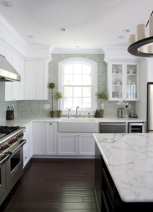
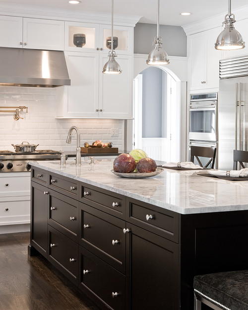
I love the look of a white + dark kitchen.  Mostly white with accents of dark woods is such a classic and chic look to me.  I think it has the ability to work in both traditional and modern homes in it's own way.  I've been pinning a lot of images in this scheme lately and I'm just loving the boards.
Here are some of my favorites.


This whole room feels traditional and then there bar stools just add in an unexpected industrial touch - works perfectly!

The use of the dark wood island keeps this kitchen from looking boring, but using the same countertop helps keep it cohesive. 


Love these stools!  The nailhead trim that ties back to the couch is a great touch. 
image


mordern. 


Another dark island.  This one keeps the room from feeling too stark and cold by balancing out all the stainless steel. 

Wednesday, June 13, 2012

weekly faves - anthropologie

I can always count on Anthropologie when I need fun, quirky items for a client, friend, or myself.  I hadn't been on their website in a few weeks so I spent some time on it yesterday to look for a few things for a guest bedroom.  As usual, I was able to pull pieces with ease for a vintage-inspired look.  
I decided on grounding the space with neutrals and throwing in variations of navy.  I added in a hint of mint to for some interest.  


In other news, today is officially my LAST day at my full-time job!  Self-employment here I come.  I'm excited about the adventures that are ahead and I look forward to the challenges that will come up.  To let everyone in on the fun, I'm offering 25% off all services through next Friday, June 22nd.  Visit my services page and send me an e-mail at lindseyanneinteriors@gmail.com to get started! 
Tuesday, June 12, 2012

lonny eye candy - eddie lee

Is everyone all caught up on the latest edition of Lonny?  I spent lots of time fawning over it on Sunday night and of course the whole edition was amazing - so many inspiring articles and items, I want to post about lots of topics!
Since I can't recap the entire mag in this one blog post, I went with the one thing that caught my eye immediately - the amazing work of designer Eddie Lee!
Eddie designed a gorgeous Westhampton retreat that could not disappoint anyone!

Great color scheme - so serene with pops of blue.

I love how the lucite coffee table completely disappears.  It leaves room for the showstopper - that painting! 

Who wouldn't want to relax with on outdoor space like on the right!

Rustic chic with a touch of industrial lights. Perfect! 

Along with the amazing eye candy, Eddie gave his top summer style tips - 
1. Bring the outside in
2. Take the inside out
3. Give your rooms a summer facelift
4. Lighting is one of the most important aspects in design

For more of Eddie's tips and to see the whole feature, check out the June/July issue of Lonny here!

Don't forget to check out Eddie's website - his work is stunning!
Related Posts Plugin for WordPress, Blogger...